Over the past few years design trends have seemingly accelerated, moving beyond skeuomorphic design into the brave new world of flat design, where minimalism and typography sit at the core of its methodology. As a result, it was time that my blog received a design facelift of sorts. In this article, I cover the design decisions I made, the inspirations I drew from, and I take a look forward to where I see the current design trends moving towards.
It is important to look at these design trends not just from a visual point of view, but to understand why they have evolved in this manner; what experience are they trying to convey? Design holistically is not about pretty pixels, it runs deeper than simply just that. Every design decision aims at supporting the end user experience in some form.
A look back
Over the past few years, my blog as taken on a visual design that is dramatically different to its predecessor. The most recent of which can be seen in this screenshot from 2011:
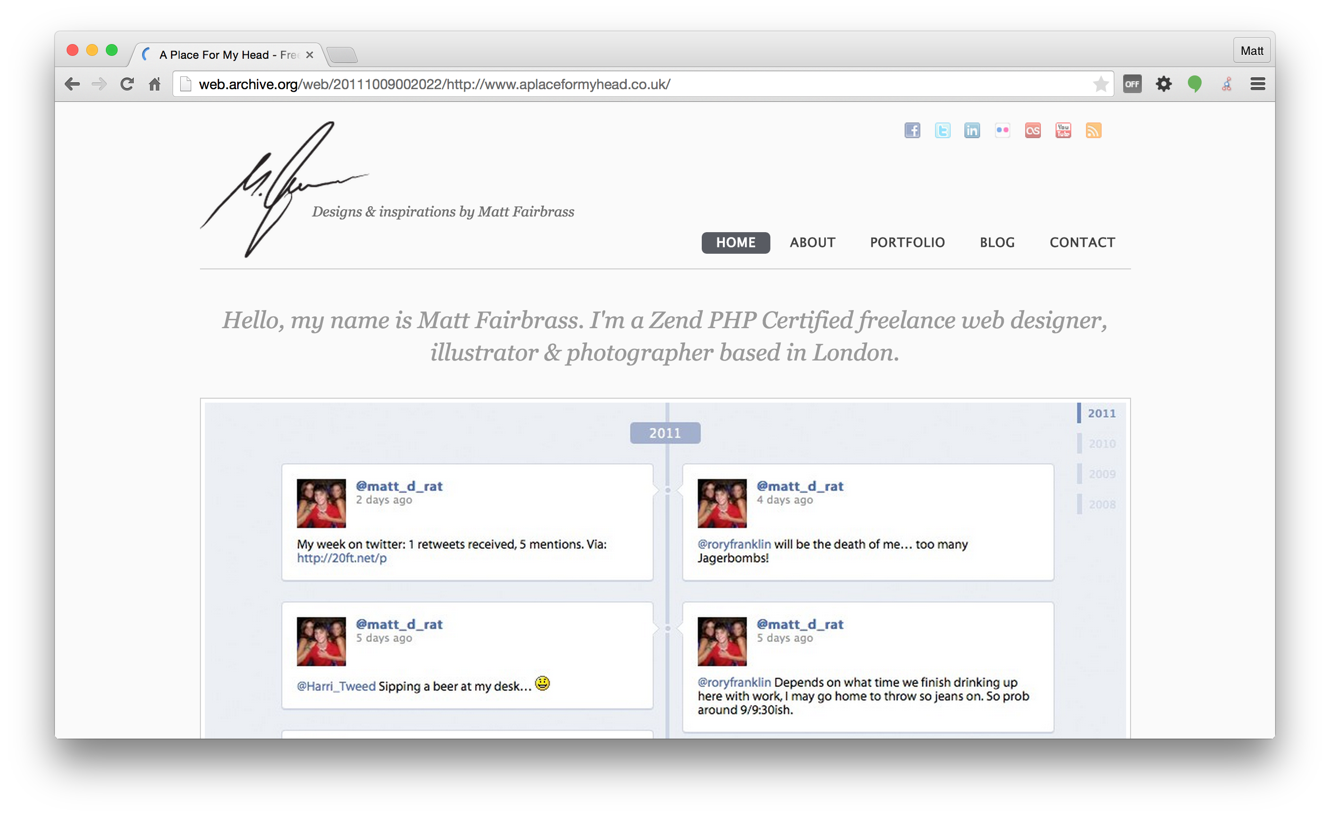
Even back in 2011, we can see the design for mattfairbrass.com was taking a minimalist approach, bringing the content to the front and centre. But the execution of the design was somewhat disjointed, the typography and iconography wasn't consistent throughout. The design had also become bloated with content from other sources, which ultimately detracted from the main goal of the blog, the blog posts themselves.
In 2011, the way in which we were consuming content had dramatically shifted from the ways five years prior, mobile accessibility had become a key factor in designing for the web, and the 2011 design simply didn't cater for this.
Re-thinking the design
The previous iteration on the design had surfaced some key ideas I wanted to maintain in the new design. At its core I wanted the design to express a minimalistic approach, but incorporate some of the other design ideas that have evolved over the past couple of years.
Hero Image
One of my favourite design trends that emerged with great success is the hero image. Defined by Wikipedia as:
A term used in web design for a specific type of web banner. A hero image is a large banner image, prominently placed on a web page, generally in the front and center.
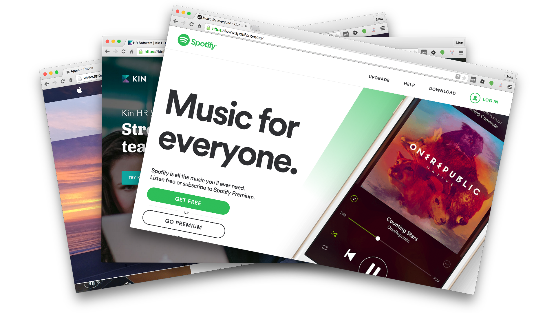
The hero image is normally used to draw the attention of the users focus towards a call to action, supported by the product itself, or other imagery that is used to invoke a certain feeling in the user.
Hero images are typically full width, breaking through the normalised padding definitions of the site. This helps to separate it from the rest of the content, allowing it to deliver more impact.
They are used heavily by minimalistic websites, as they help to inject colour and vibrancy into pages which would other wise be awash in a black and white colour palette.
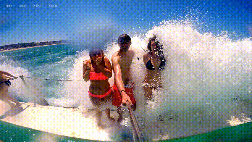
This was a trend I wanted to incorporate into the new design, but with a slight twist. I took inspiration from the login screen design in Mac OSX Yosemite, where by the wallpaper of the users desktop has a blur effect applied to it.
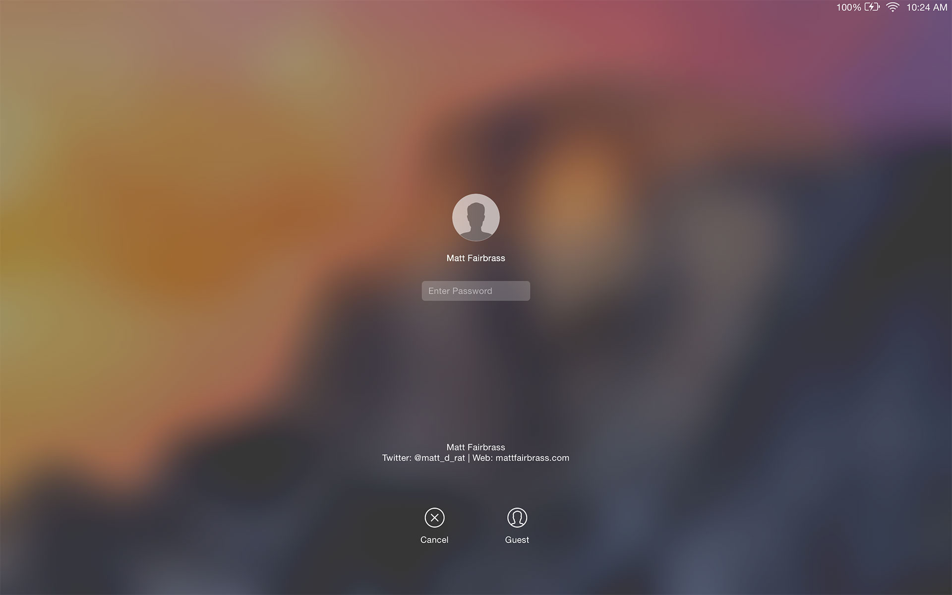
I decided to introduce this as an animation aspect for when the user scrolled down the page, gradually blurring the image more and more as the user scrolled further down, helping to enforce the call to action to explore the content cards below.
The blurring of the hero image brought with it its own technical challenges, which I will discuss at another time in a dedicated article.
Cards
 Another design trend that has emerged over the past year is the rise of cards. Popularised by Google in Google Now, which debuted on Android 4.1 (Jelly Bean), and since has seen wide adoption as part of their Material Design language, as well as by other vendors, cards aim at providing aggregated snippets of information in a consistent UI manner.
I adopted a card based layout for the main pages that show lists of posts. Using a container pattern that follows a masonry design (popularised by Pinterest in 2010), the form creates an experience of discovery, rather than one of a linear narrative.
The other advantage to using a card based layout for this type of content was that it would scale to any viewport size. This was key to accessibility when consuming the content on a mobile device vs a 4K display.
For more information on card based design, check out CardStack, a great resource aimed at unifying the way in which card based design is executed by:
Building a Card Ecosystem based on Open Web technologies and Open Source ethos that fights back against rampant lock-in.
Material Design
Having embraced cards within my new design I opted to fully adopt Material Design as well. This helped to anchor a number of design elements (inputs, buttons, typography etc..) in a familiar tactile reality of that of the physical world, with the flexibility of a design principle which is able to create new affordances that supercede those in the physical world, without breaking the rules of physics.
Exploring the Z-Axis
I was really inspired by this article over on A List Apart which talks about the importance of designing for the third-dimension as we begin to face design challenges for an increasingly diverse array of shapes and sizes.
The obvious places where I have incorporated this principle is for the comment modal and share bottom sheets on the cards themselves. Modals are nothing new, but they serve an important role, allowing users to quickly interact with a card without needing to leave the exploration of other content.
A more subtle place I incorporated the z-axis is within the main container on each page itself. The hero image is anchored in a fixed position, as you scroll down the page the main content slides up over the top, creating a sudo-parallax effect. This subtle use of the z-axis allows me to communicate what is important at that point in time to the user.
A look to the future
No one can say with any degree of certainty the direction design for the web will take in the future, but there have been some key indicators in the latest design trends which might suggest a nod at the direction designers are going.
I predict the key areas we will see dramatic design improvement and focus in the coming year will be with the use of animation and the z-axis.
We're already seeing it with the card design paradigm, and the evolution from flat design to material design. Apple heavily revamped animations and transitions in iOS7, expanding further with this principle in iOS8. They also heavily use the z-axis with design elements that utilise translucency and blurring of lower layers.
The shift to card layouts will also continue to play a heavy influencing role. My hope from a developer point of view is that we will begin to see a set unifying API's that define how cards from one application act in another. From a designer point of view, I hope to see a unified set of design principles adopted by all card layouts that facilitate this integration, without the overall design becoming a disjointed frankenstein mess.
Conclusion
The new design of my blog is anchored around one key element, the content. The content of any blog is the single most important thing, after all it's what adds value to the site, which would otherwise become just another domain taking up space in a server rack somewhere.
I wanted the content to always be front and centre to the reader, creating a more relaxed, accessible, and hopefully more enjoyable reading experience. This single goal led every single design decision, from choice of typography, colour palettes, to the right amount of negative space to use, or even how the content is going to be consumed. The design should almost melt away into the background, serving only to support the content.
Working on the re-design for mattfairbrass.com has reinvigorated my passion for writing, and I look forward to actively blogging more often. Here's to the next post.
